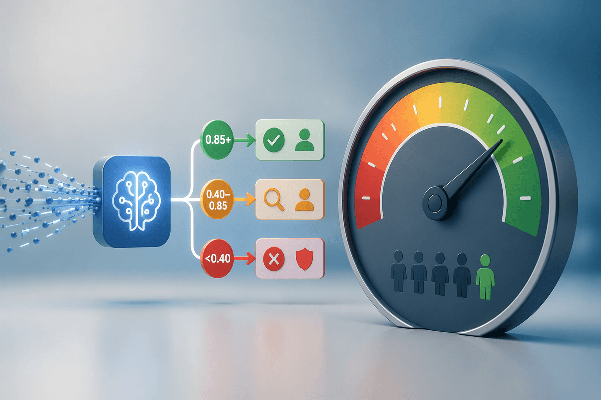
Why chart descriptions fail when accuracy really matters
A familiar pattern: you paste a chart into an AI tool, ask for an accessible description, and get something that sounds polished but quietly breaks under scrutiny. It names the wrong peak, implies a trend that isn’t there, or misses that one series is on a secondary axis. If the chart has uncertainty bands, missing months, or a denominator change, the description often flattens those details into a confident storyline.
This failure mode isn’t “bad writing.” It’s usually missing evidence. The model is guessing because it doesn’t truly read values the way an analyst would, and because many charts don’t encode key context in a way the prompt can reliably capture (units, filters, time windows, definitions). The cost shows up later: a screen-reader user gets a misleading takeaway, reviewers waste time debating intent, and the team ships a description that’s accessible in form but not in truth.
Accuracy starts slipping most when the chart stops being simple: multiple lines that cross, small but meaningful changes, or outliers that are the entire point. If you need the description to support decisions, audits, or compliance, “close enough” isn’t close—it’s risky. The practical reality is that AI can help, but only when you design for verification and treat the description like a claim that must be grounded, not a caption that must be fluent.
Start by deciding what the description is for
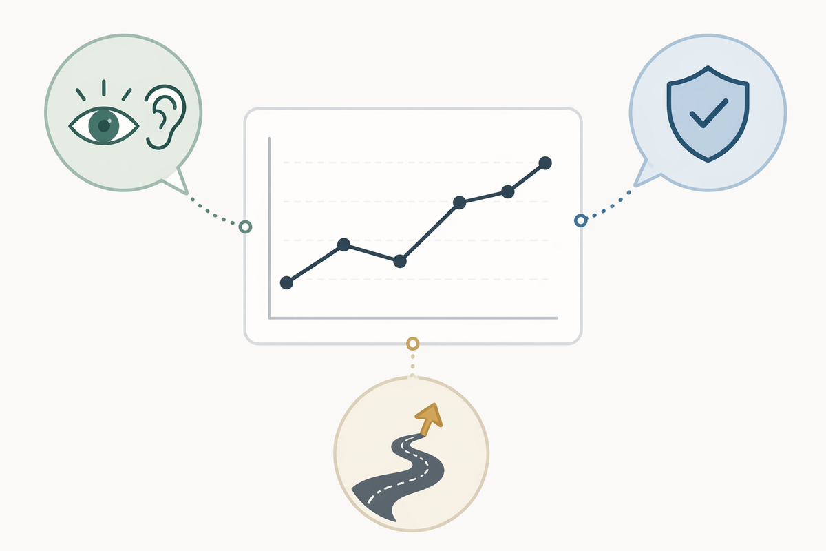
Most teams ask for “a chart description” as if there’s one correct output. In practice, the same chart needs different words depending on the job. A screen-reader alt text block should help a user form the right mental model quickly (what’s being compared, the overall pattern, and any standout exceptions) without forcing them through every data point. A compliance note may need exact thresholds, dates, and definitions. A decision-support summary might foreground the one change that affects a roadmap call, even if it’s visually subtle.
Write down the purpose before you prompt. Decide what the reader must be able to do after hearing it: spot an anomaly, compare categories, confirm a KPI direction, or understand uncertainty. Also decide what not to do: don’t infer causes, don’t “smooth” missing data, don’t treat a short window as a long-term trend.
This one choice sets your acceptance criteria. It also sets your cost: the more the description must be auditable, the more you’ll need concrete values, tighter review, and a clearer trail back to the source chart.
Give the AI the right chart facts, not vibes
You can’t prompt your way out of missing inputs. If the model only “sees” a picture, it will often narrate what looks plausible: a “steady increase,” a “sharp dip,” a “record high.” Those are vibes. When accuracy matters, pass the facts you’d want a human reviewer to have: chart type, axes labels, units, time window, filters, and any definition changes (like a KPI recalculation mid-quarter). If there’s a secondary axis, say so explicitly, and name which series uses it.
Then provide a small set of anchor values the description must not contradict. Think: start and end points, the max/min with dates, and one comparison that matters (“Series A is ~2x Series B in March”). For multiple series, list the series names exactly as shown and call out crossings or missing periods. If uncertainty bands or error bars exist, state what they represent and whether they change meaning across the chart.
The payoff is that review becomes checking, not re-analysis, and the final description reads like a grounded claim rather than a polished guess.
A simple structure that keeps descriptions grounded
A reliable description usually has the same bones, even when the chart is messy. Start with a one-sentence “what this is” line: chart type, metric, population or filter, and time window (“Line chart of weekly churn rate for paid users, Jan–Jun 2026”). That single sentence prevents the model from inventing scope, and it gives reviewers something concrete to confirm against the dashboard.
Follow with a short “pattern and exceptions” block. State the overall direction only if it’s supported by your anchor values, then name the few moments that change interpretation: the max/min (with dates), any crossings between series, gaps, or definition changes. If uncertainty is shown, describe what it represents and whether the uncertainty overlaps enough to make a “winner” unclear.
End with a constraints line that limits overreach: what the chart does not show, what shouldn’t be inferred, and any data quality flags (“April is partial,” “secondary axis for revenue,” “causes not implied”). This adds a small writing cost, but it sharply reduces confident storytelling.
Prompting tactics that reduce hallucinations and omissions
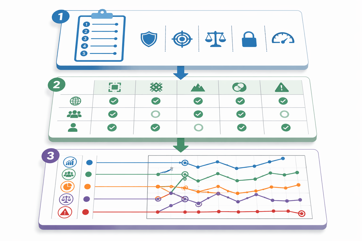
You’ve probably seen the “sounds right” failure: the model fills gaps with plausible phrasing. A simple fix is to turn the prompt into a checklist with hard constraints. Ask for a specific number of bullets (for example: “exactly 5 bullets”), each tied to named evidence you provided (“use only the anchor values, series names, dates, and units below”). Then add an explicit ban list: no causal explanations, no “record” language unless a max is stated, no “steady” unless start/end and at least one mid-point support it.
Force coverage so omissions are visible. Require one bullet each for: scope (metric, unit, time window, filters), overall pattern (if supported), extremes with dates, cross-series comparisons (including crossings), and data caveats (missing periods, secondary axis, definition changes, uncertainty). If the chart has multiple series, require the model to mention every series name at least once, even if only to say “Series C stays flat relative to others.”
Finally, ask for a “claims and evidence” block: each claim followed by the exact value(s) it used. This adds tokens and can feel repetitive, but it makes hallucinations cheap to catch and disagreements concrete.
How to verify quickly without redoing the whole analysis
You usually don’t need to “re-analyze the chart” to verify an AI description—you need to confirm a small set of claims that, if wrong, would mislead. Treat the output like a checklist: does it match the scope (metric, unit, time window, filters), and does every directional statement have an anchor value behind it? If the model says “rising,” verify start/end and one mid-point. If it says “spike,” verify the max and the nearest baseline point. If it compares series, verify the ratio or difference at a named date.
Make verification fast by requiring traceable claims. If the draft includes a “claims → evidence” block, you can spot fabrication immediately: missing dates, values that don’t exist, or a series name that never appears in the source. Focus extra attention on known risk zones: secondary axes, crossings, missing periods, and uncertainty bands. The practical constraint is that you still need someone who can access the underlying data or tooltip values; without that, “review” becomes guesswork with nicer wording.
When something fails, don’t rewrite from scratch. Replace only the failed claim with a corrected one and re-run the prompt with a tight instruction: “Keep bullets 1–3 unchanged; revise bullet 4 using only these corrected anchors.” This keeps the model from reintroducing new errors elsewhere and preserves review history, which matters when descriptions ship as part of an accessible report.
Putting it together: repeatable workflow and realistic expectations
On a real team, the repeatable workflow is boring by design: define the description’s purpose and “must include / must not infer” rules, extract chart facts and a short list of anchor values, then generate a draft in a fixed structure (scope, pattern/exceptions, constraints). Run a quick verification pass that checks only the highest-risk claims: direction, peaks, crossings, axis usage, missing periods, and uncertainty language. When something fails, patch the specific claim and re-generate only that part, keeping the rest stable.
Set expectations that match the inputs. AI can reliably help with phrasing and consistency, but it won’t replace access to underlying values, and it won’t notice definition changes you didn’t tell it about. Someone has to supply facts and do the checks. The payoff is predictable quality—descriptions that read clearly, stay within evidence, and are safer to ship to screen-reader users and decision-makers alike.